Views: 0 Author: Site Editor Publish Time: 2026-08-08 Origin: Site


Selecting the right deck color is a high-stakes decision. A mismatched outdoor living space easily disrupts visual harmony. A mismatch against your exterior architecture negatively impacts curb appeal. It can even hurt overall property value over time. Choosing the wrong shade for your local climate often causes trouble. You might face unforeseen maintenance hurdles. Heat retention issues frequently plague sunny, south-facing spaces. Moving beyond basic aesthetic preferences takes effort. It requires a structured evaluation of color theory. We must weigh contrast against blending. Architectural alignment and real-world environmental factors demand careful thought. This guide provides an evidence-based framework. You will learn to evaluate deck colors against your home's siding. We cover trim and structural style considerations extensively. Our method ensures a cohesive, long-lasting investment.
We need a solid foundation for exterior color selection. Many homeowners guess when picking outdoor shades. You should follow established architectural principles instead. The "Rule of Three" principle serves as your baseline. Treat your home's exterior as a three-color palette. The dominant color always belongs to your siding. Siding covers the largest surface area. The secondary color includes your trim and roofing. These elements frame the house visually. The accent color highlights specific exterior features. Your decking and doors fall into this accent category. High-quality WPC Decking should act as a grounding accent. It must anchor the building to the landscape effectively.
We recommend two primary strategies for selecting this accent tone. First, consider the high-contrast strategy. This approach creates a bold visual statement. It works best for modern or clearly defined architectural spaces. Contrast highlights the clean lines of contemporary builds. You might pair charcoal or slate grey decking against white stucco siding. Light siding makes dark decking pop. This separation gives each surface distinct visual boundaries. It prevents elements from blending into a muddy visual mess.
Next, examine the complementary or tonal strategy. Some properties require a softer aesthetic approach. This strategy suits traditional or heavily landscaped environments. You want the structure to melt into the natural surroundings. We often pair warm cedar or auburn decking against classic exteriors. Beige, stone, or brick facades look stunning next to warm wood tones. The goal here prioritizes harmony over visual drama.
Finally, we must address the "Uncanny Valley" risk. Many homeowners try to match their decking directly to natural wood siding. Others try matching it to interior hardwood floors. We strongly warn against this approach. Manufactured boards feature printed or embossed grain patterns. Natural wood has random, organic variations. Close-but-not-quite matches create extreme visual tension. Your eyes instantly notice the artificial discrepancy. You should aim for deliberate contrast instead. Deliberate complementary undertones also solve this problem beautifully. Never force an exact match across different materials.
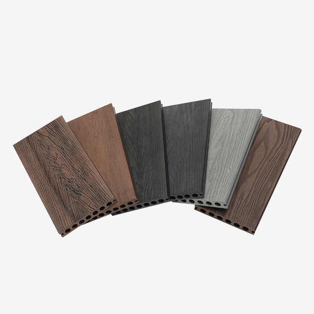
Different building styles demand specific color profiles. You cannot apply one universal palette across every home. We categorize color alignment based on distinct architectural movements.
Modern architecture prioritizes stark geometry. These criteria include clean lines and industrial materials. The color palettes usually lean monochromatic. Heavy glass facades and metal railings dominate these structures. Your decking choice must respect these minimalist rules. Optimal choices include cool greys, silver, black, or ash-toned composites. These shades mimic concrete or steel beautifully. They reinforce the industrial aesthetic without feeling cold. You should choose uniform grain patterns over highly varied textures. Busy textures distract from the sleek architectural lines. A smooth, monochromatic board fits modern design perfectly.
Traditional builds feature intricate details and deep warmth. Their criteria include earth tones and natural stone facades. Complex trim work often highlights the exterior edges. These homes require colors grounding them in nature. White trim frequently acts as a buffer between siding and decking. Optimal choices include rich browns, mahogany, and warm walnut tones. Deep wood-grain embossing adds necessary architectural weight. The heavier visual texture complements the stone and brickwork. It balances the visual heaviness of a traditional facade.
These homes celebrate relaxed, organic styling. Their criteria focus on weathered aesthetics and natural integration. They evoke feelings of age and history. Optimal choices include Vintage Color WPC Decking. This category features distressed browns and greys. Weathered teak or whitewashed tones also work beautifully here. The multi-tonal streaking resembles reclaimed barn wood perfectly. It adds instant character to coastal cottages or farmhouses. The relaxed styling requires organic, muted tones rather than stark contrasts.
| Architectural Style | Key Criteria | Optimal Decking Colors | Texture Recommendation |
|---|---|---|---|
| Modern & Contemporary | Clean lines, monochromatic, industrial | Cool greys, silver, black, ash | Uniform, minimal grain |
| Traditional & Craftsman | Earth tones, stone facades, complex trim | Rich browns, mahogany, walnut | Deep, realistic wood-grain |
| Rustic & Coastal | Weathered, relaxed, natural integration | Distressed browns, greys, whitewash | Multi-tonal, heavily distressed |
Color choices affect daily usability directly. Aesthetic appeal matters, but functional performance dictates long-term satisfaction. We must evaluate climate, heat, and maintenance factors closely before making a final decision.
Color dictates surface temperature significantly. Darker boards absorb and retain much more solar heat. Light energy converts to thermal energy upon impact. This becomes a serious limitation for south-facing, unshaded decks. Barefoot traffic becomes uncomfortable during peak summer months. We urge you to consider local climate conditions. A black deck in Arizona poses usability problems. A black deck in Seattle might feel perfectly fine. Always address this thermal limitation before finalizing a dark color choice.
Your deck color dictates your cleaning schedule. Different tones highlight different types of environmental debris.
Many consumers misunderstand how composite materials age. First-generation composites faded drastically under UV exposure. Modern capped composites are highly fade-resistant. Manufacturers wrap the core in a protective polymer shell. This shell blocks UV rays and prevents major color loss. Clarify that while modern capped boards resist fading, a minor initial "weathering" phase may occur. The extreme surface shine often dulls slightly during the first few months. Evaluate warranty documents regarding colorfastness. Reputable brands clearly state acceptable fade margins over time.
Never buy materials based on digital photos alone. Screen settings alter color perception completely. You must conduct a physical evaluation on your property. We developed a foolproof four-step process for finalizing your selection.
Balancing aesthetic contrast with functional pragmatism takes effort. Matching your deck to your architecture requires careful thought. You should prioritize mid-tone or intentionally contrasting shades. This approach avoids visual clashes and uncanny valley effects. Respect the rule of three when planning your exterior palette. A cohesive outdoor space significantly elevates your home.
Take immediate action on your project. Order physical samples of your top three choices today. Conduct the 24-hour on-site evaluation process outlined above. Test the boards under wet and dry conditions. Finalize your decision only after evaluating real-world lighting, then request a final project quote.
A: There is no strict rule, but contrasting your siding is generally safer. If your house is dark, a lighter mid-tone deck brightens the space. If your house is light, a darker deck grounds the architecture.
A: Not necessarily. When paired strategically, the distressed, multi-tonal look of vintage color WPC decking can add organic warmth and texture to otherwise sterile modern exteriors.
A: High-quality, capped WPC decking is designed to retain its factory color with minimal fading. Unlike natural wood, you cannot rely on it to "weather" into a different shade, making the initial color choice permanent.
A: Yes. Using a primary color for the main deck floor and a secondary, contrasting color for picture-framing (borders) or stair treads is a common architectural technique that enhances safety and visual interest.